Timberworks
Bringing together creative businesses, start-ups, and innovators in the heart of Shoreditch.
Deliverables
- Brand identity*
- Brochure
*One-day sprint
Year
2025
Timberworks is a contemporary office building* in the heart of Shoreditch.
As a hub for creative businesses, start-ups, and innovators, I was tasked with designing a distinct brand direction that reflects both the building’s modern design and the area’s creative energy.
And yup, you heard that right — Rome wasn’t built in a day, but this brand identity was.
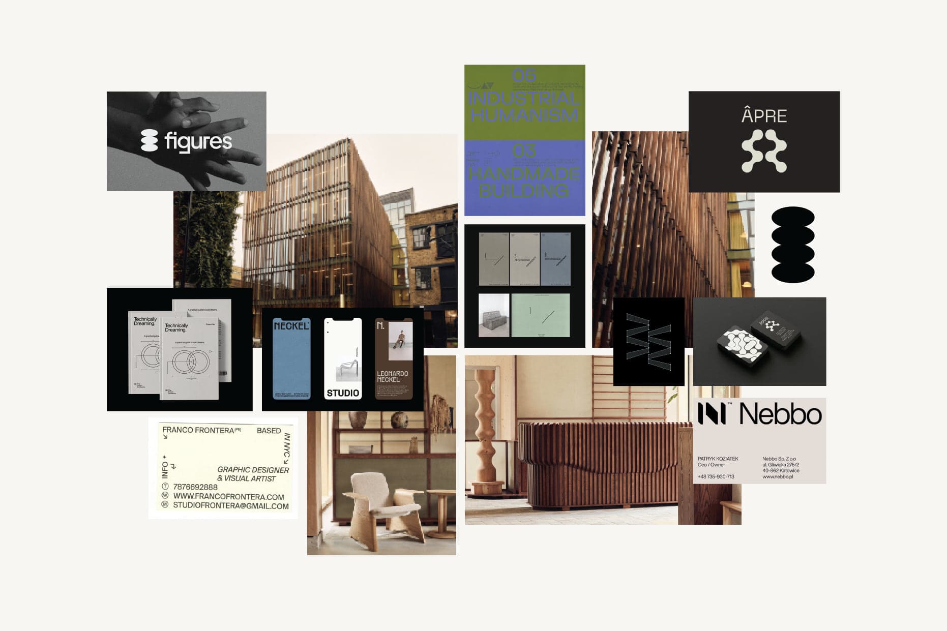
Drawing on the building’s mid-century modern architectural features and furniture in establishing a direction for the wordmark and graphic elements.
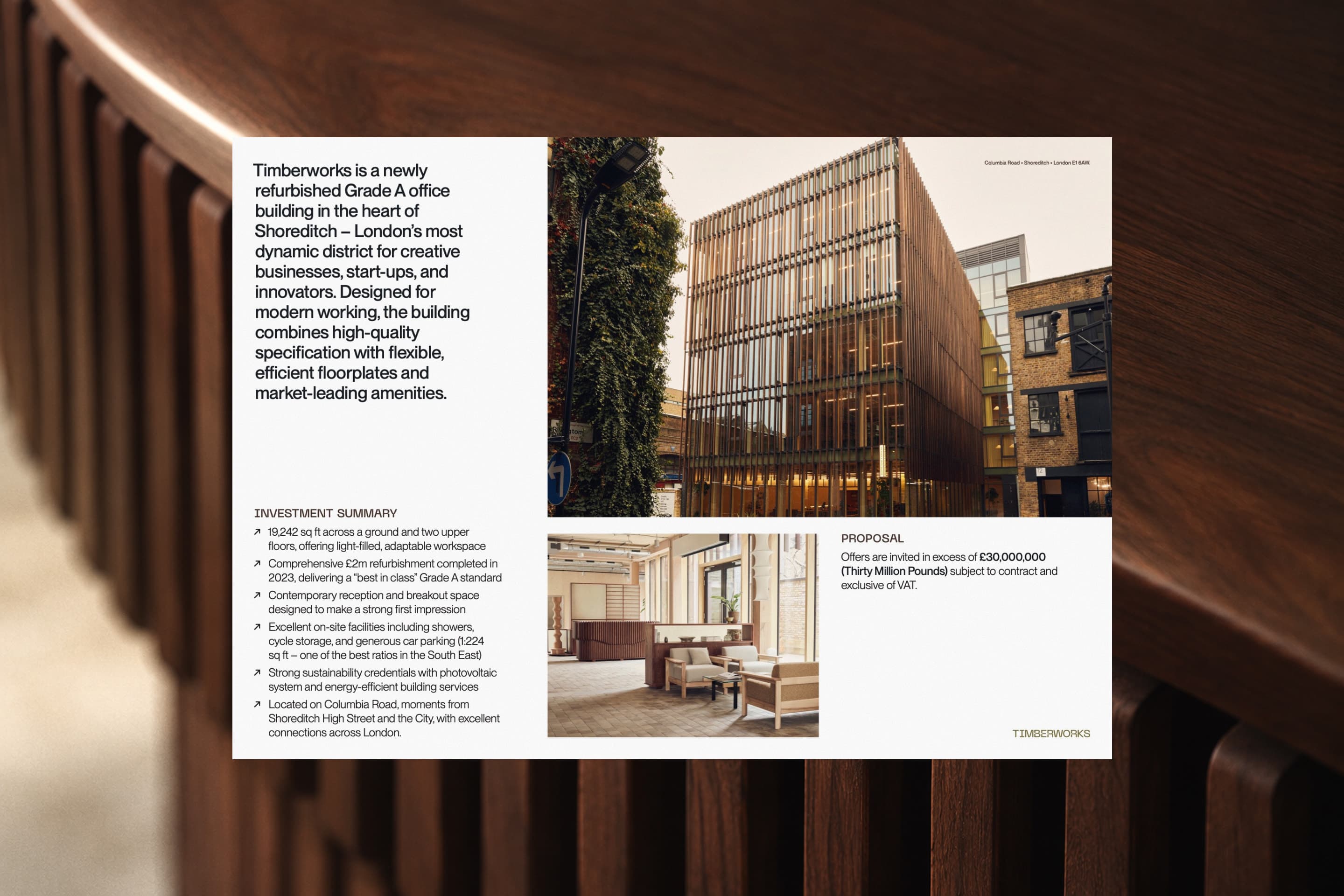
Timberworks’ brand and graphic elements are applied across the introductory brochure. For prospective investors, commercial real estate professions, and innovative businesses considering office space in Shoreditch, it was important for the typography and layout that feels professional, and distinctive.