Skip to content
Izzy Crossland

Archetype

A curation of typography and its significance in our everyday lives.

Deliverables

  • Publication
  • Brand identity
  • Typography
  • Exhibition

Year

2022

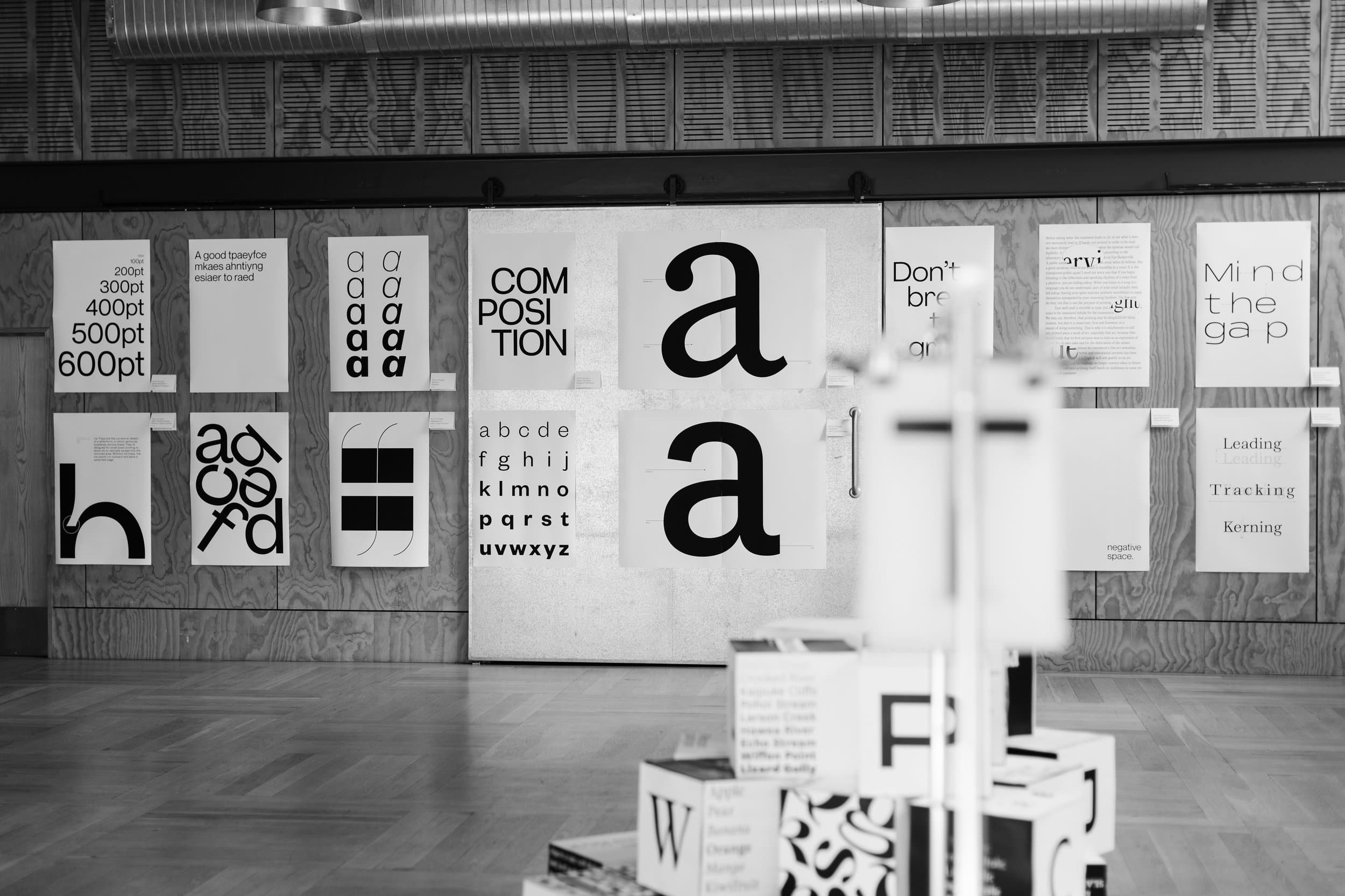
The Archetype exhibition in black and white: posters of point sizes, an alphabet and a giant letter a on a plywood wall, with letter-printed cubes in the foreground.

Typography is everywhere, but good type is invisible. While it often passes unnoticed by readers, type plays an essential role in conveying tone, meaning, and evoking emotions and responses. Blending art with science, typography serves as a fundamental element of visual communication design.

Archetype was created to educate, empower, and honour all aspects of typography. Our goal was to offer non-design visitors the chance to learn about the significance of type by sharing our insights and passion while also inspiring our design audience to feel empowered by the work they do.
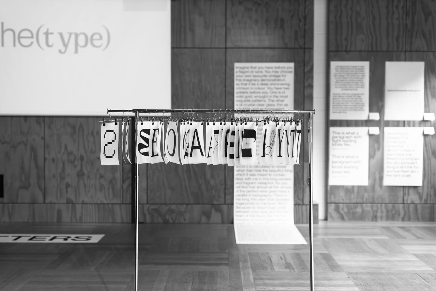
A clothes rack hung with cards, each printed with a single large letter, in front of walls of type posters.
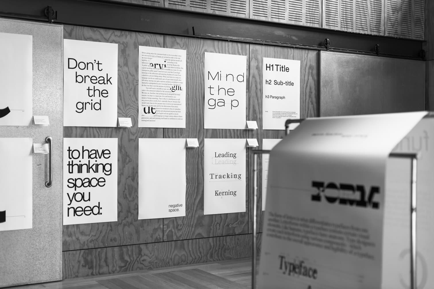
Posters reading 'Don't break the grid', 'Mind the gap' and 'Leading, Tracking, Kerning' on a plywood wall, behind a typeface display stand.
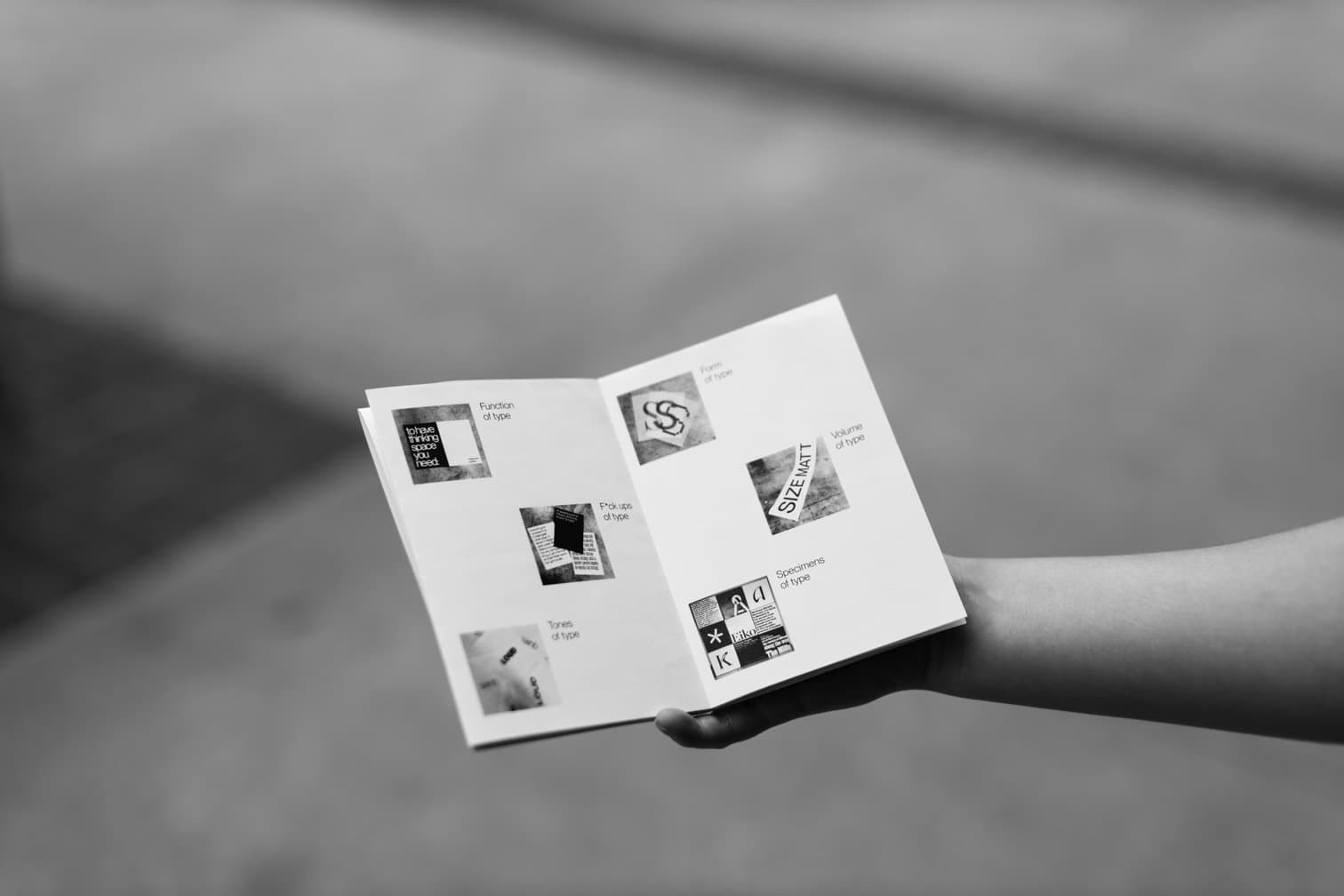
A hand holding open the Archetype booklet, with photos of the exhibition grouped by theme, like the form and volume of type.
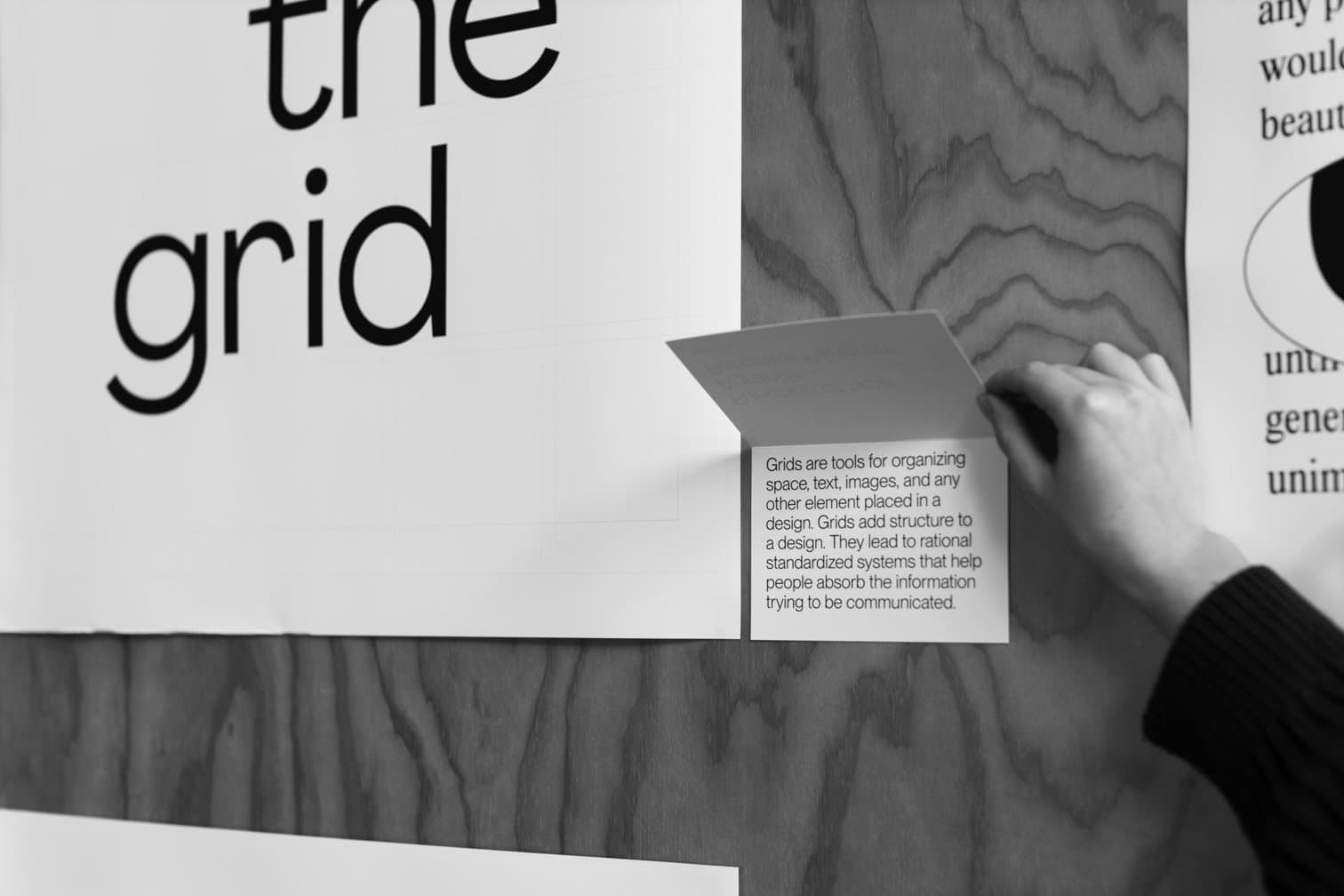
A hand lifting a card below a 'the grid' poster to reveal a short note on what grids are for.
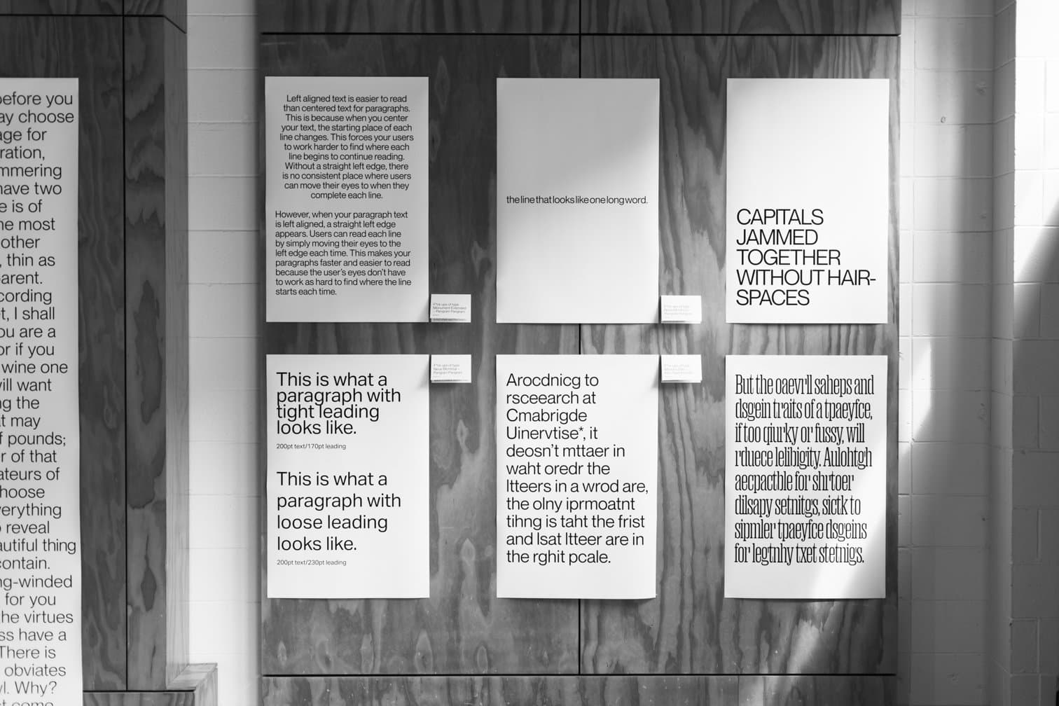
Posters showing type rules in action: left-aligned text, tight and loose leading, words with no spaces, capitals jammed together and scrambled spelling.
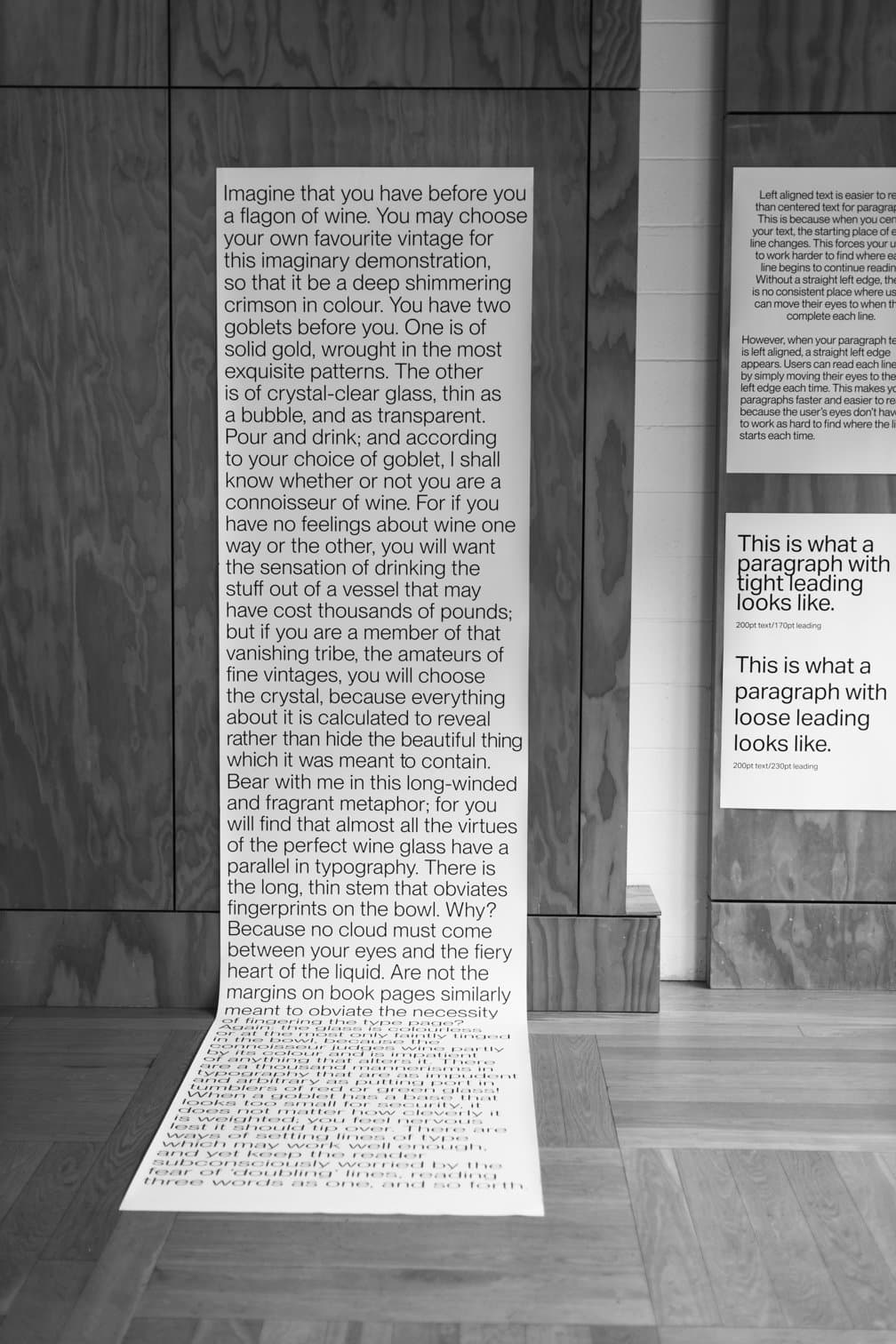
A long paper scroll of text runs down a plywood wall and spills across the floor.
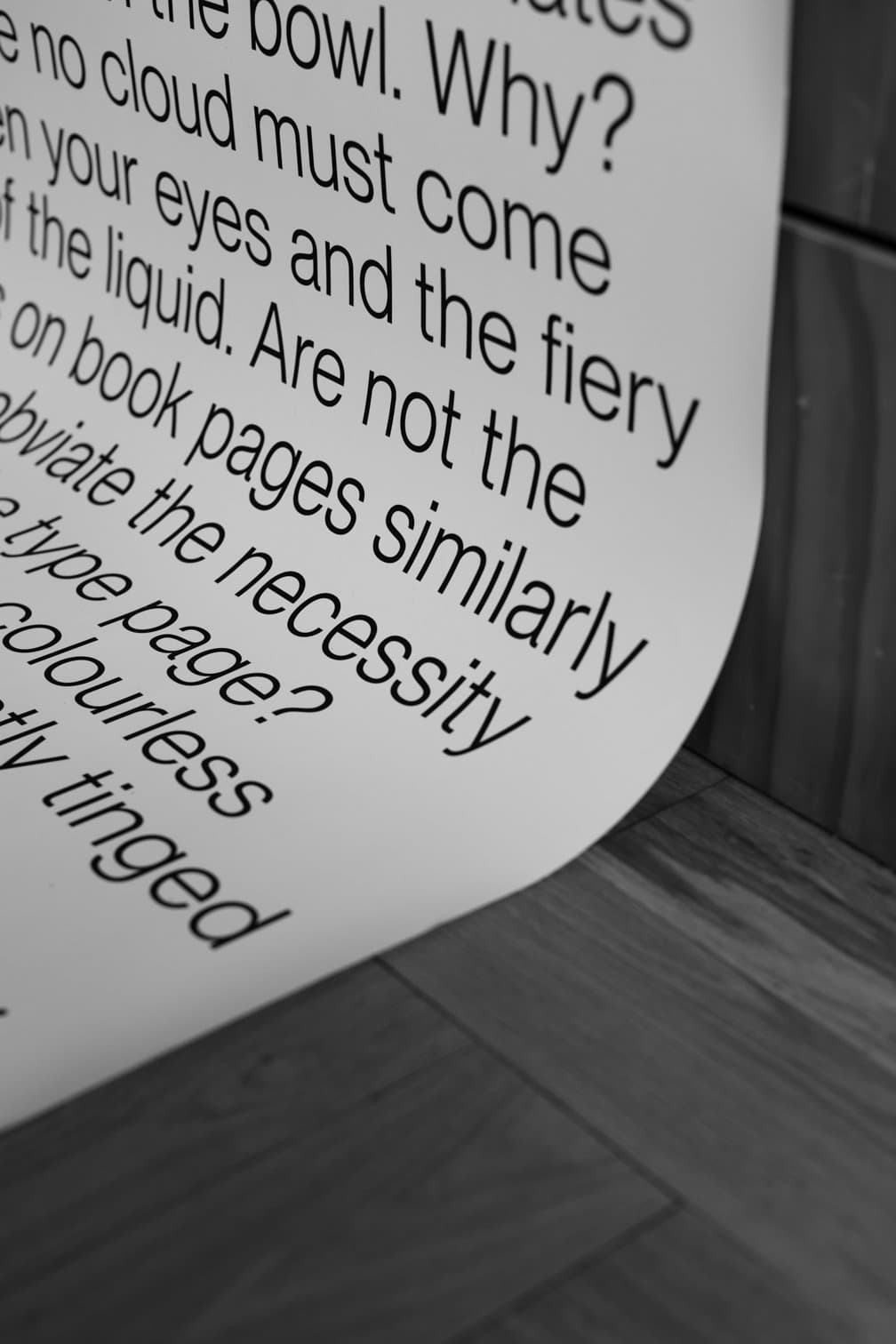
Close-up of the scroll's printed text curling where it meets the floor.
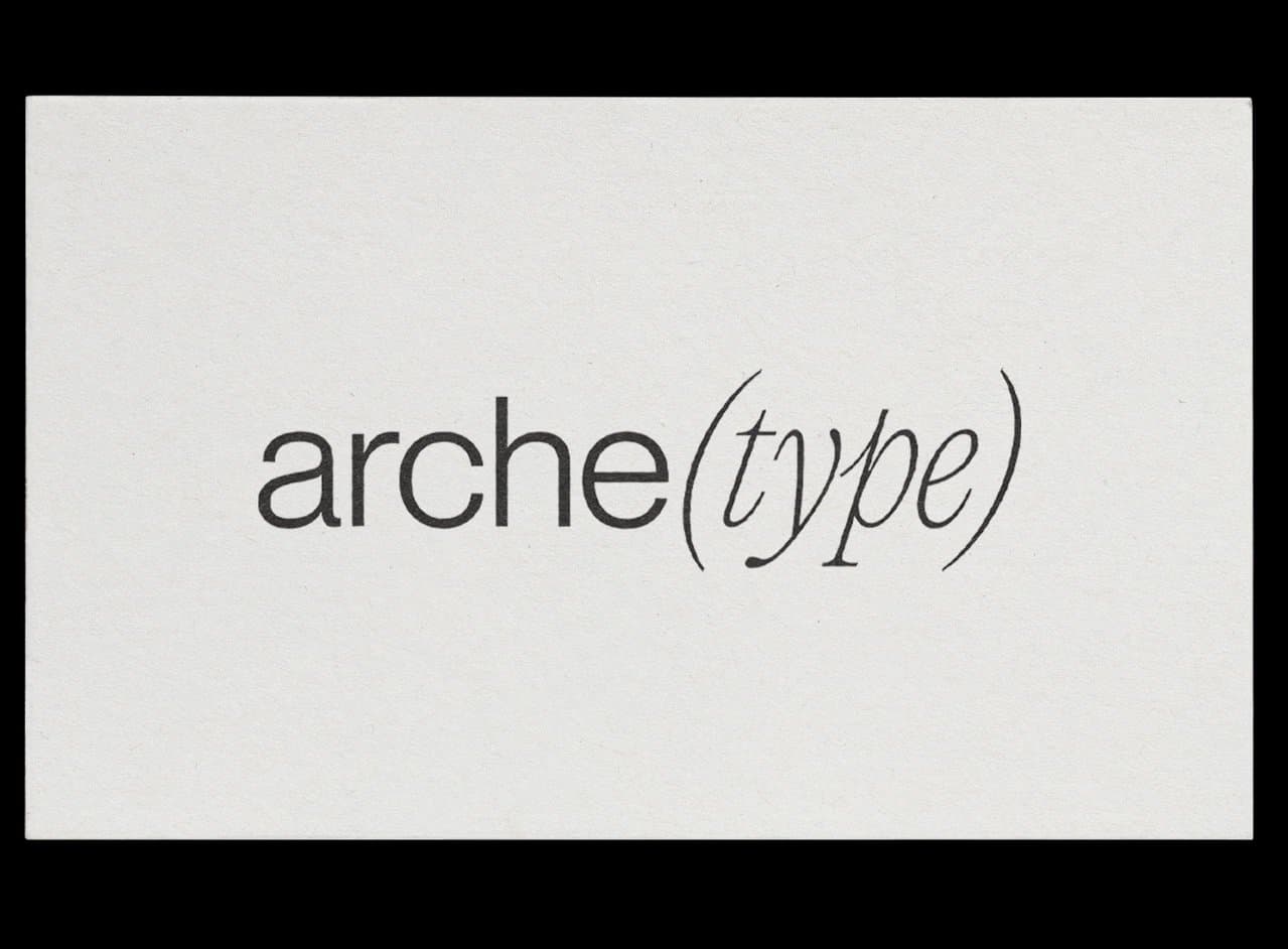
The arche(type) wordmark printed on textured off-white card.
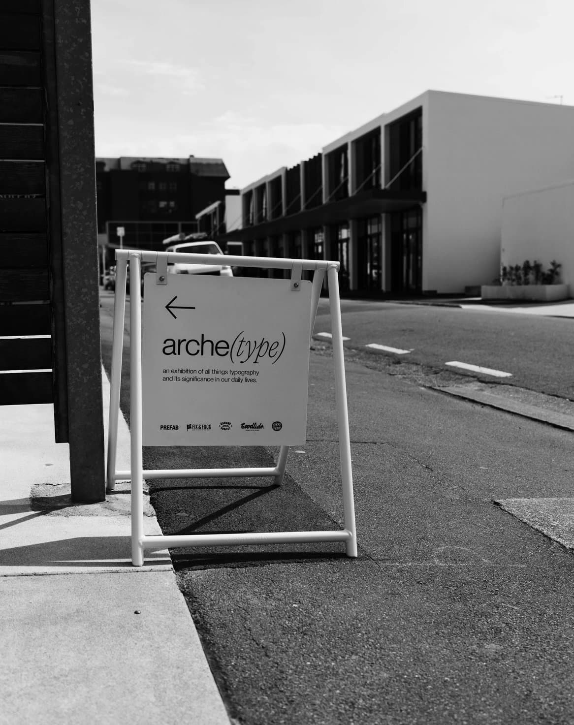
An A-frame street sign with the arche(type) wordmark and an arrow pointing visitors to the exhibition.
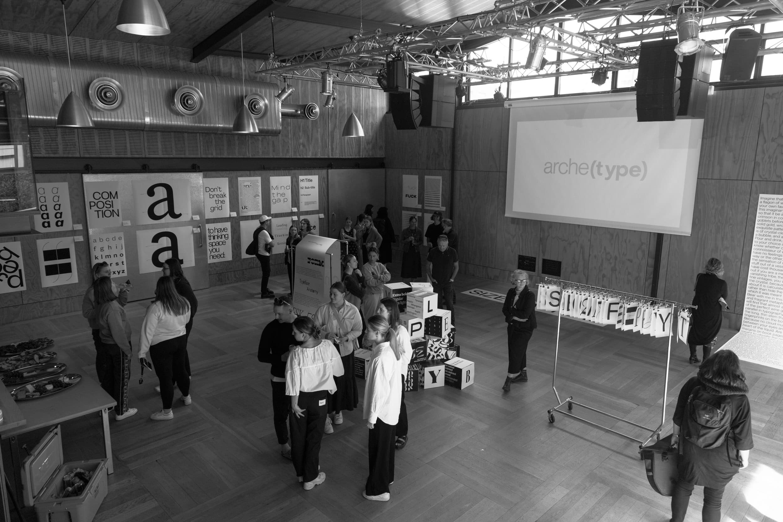
Visitors fill the exhibition hall, browsing posters, letter cubes and the letter rack beneath a projected arche(type) title.
Previous project: Youtility