
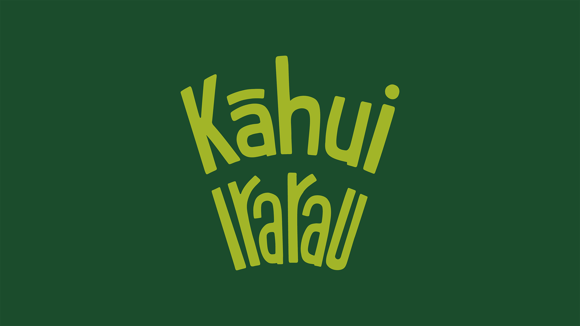
Kāhui Irarau
Empowering rainbow and takatāpui communities.
Year
2022
2024 Rainbow Excellence Awards Winner
Supreme Award & Impact Award
Deliverables
Brand identity
Brand guidelines
Social media collateral
Kāhui Irarau was born out of a strong commitment to community values and Tiriti-centered approaches. The project was designed to establish an authentic brand that represents and provides opportunities for takatāpui and rainbow communities at a New Zealand university. It has become a groundbreaking platform offering a safe and inclusive space dedicated to support, connection, and initiatives that strengthen diversity and inclusion.


The process kicked off with a collaborative workshop in Te Whanganui-a-Tara, Wellington, bringing people together to explore ideas using design-thinking tools. From this workshop emerged initial brand names and positioning statements. Following that, an online survey was shared widely among alumni, current students, staff across various campuses, and distance learners, gathering over 120 responses.
Throughout the project, community voices and experiences continued to shape design choices, highlighting key themes such as the need for a safe and supportive space, a clear desire for positive change, and strong enthusiasm for a Te Reo Māori name.
e koekoe te kōkō,
e ketekete te kākā,
e kūkū te kererū
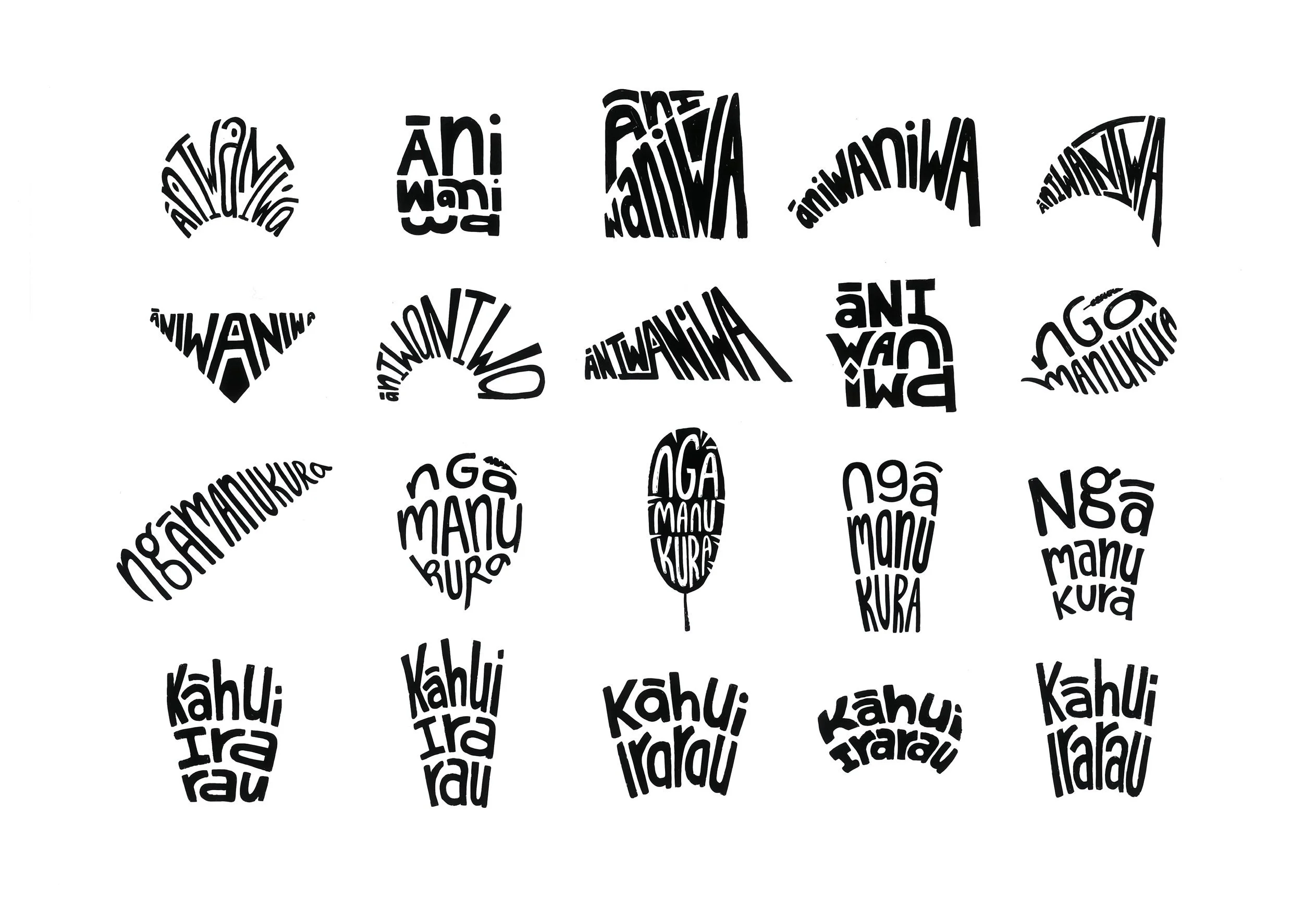
Kāhui Irarau was crafted with thoughtful design choices, resulting in a visually compelling and narratively rich identity. The design process involved several months of wānanga, intention-setting sessions, and collaborative hui. Through this collaborative journey, the platform was gifted its ingoa (name) by drawing deeply on mātauranga Māori and collective kōrero.
The name combines ‘kāhui’—meaning a flock or collective of animate and inanimate things—with ‘irarau’, representing diverse life principles, genetic make-ups, and genders. Central to the platform’s kaupapa is the whakataukī ‘e koekoe te kōkō, e ketekete te kākā, e kūkū te kererū’, recognising and celebrating the inherent diversity of rainbow and takatāpui communities.


Kāhui Irarau’s visual identity was thoughtfully designed to feel welcoming, approachable, and relatable with a younger student audience in mind. Featuring a playful, hand-drawn logotype arranged to evoke tail feathers, the identity draws inspiration from the hero manu, incorporating subtle references to both the pride flag and the university’s own brand colours. The resulting palette includes interchangeable light and dark tones, offering flexibility and appeal for students engaging with the brand.
Illustrated feathers of different shapes, sizes, and colours were developed to support the brand’s storytelling around individuality and the celebration of diversity. Each feather arrangement carries deeper meaning, translating whakapapa into visual form: tūī feathers symbolise wisdom and the sky; kererū feathers represent the forest, food, and vitality; and kākā feathers reflect grounding support from the Earth and ancestral connections.


Since its launch in 2023, Kāhui Irarau has made significant strides in fostering inclusivity and community engagement within the university. The inaugural Rainbow Orientation spanned all campuses, attracting over 600 students to various events. The platform's presence extended to major events like the Big Gay Out and Out in the City, where their stands drew more than 1,500 visitors. Participation in initiatives such as Sweat with Pride led to fundraising efforts exceeding $5,100. The official launch event saw attendance from ninety individuals, and the platform's social media channels have experienced steady growth. Additionally, Kāhui Irarau recently presented at the Cross-agency Rainbow Network Conference, sharing insights on indigenous knowledge and strengthening connections among takatāpui and rainbow communities in the tertiary sector.
